Patrick Cain, who correctly describes himself as “a journalist who makes maps for the Web,” has posted a couple neat sets of tips to his blog. Basically, they suggest ways to tweak some of Google's code to improve presentation. Check out his blog tips at
- http://www.patrickcain.ca/?p=230
- http://www.patrickcain.ca/
Simplifying map display
I’ve never been a fan of the way Google Maps handles local labels (neighbourhoods, for example) – they are often redundant, inconsistent and wrong, as well as cluttering the map visually.
These examples didn’t take long to collect:
Leslieville is so nice they labeled it twice:
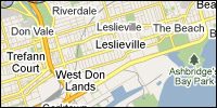 |
Same with the Bridle Path, more or less:
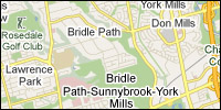 |
Google has solved the unresolvable Beach vs. Beaches debate by using both labels:
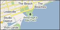 |
Forest Hill South is not an ambition of well-off Annexites, but is actually north of Forest Hill:
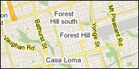 |